


Color Stories of Christmas: What Red, Green, Gold, and Neutrals Mean in Interior Design
Christmas is one of the few times of year when color takes center stage in our homes. Even people who prefer minimal or neutral interiors often introduce richer tones, metallic accents, and deeper contrasts during the holiday season.
But these colors are more than festive tradition, they are powerful design tools. Understanding what red, green, gold, and neutrals communicate emotionally can help interior designers and homeowners create spaces that feel intentional, timeless, and balanced long after the holidays are over.
Red: Warmth, Energy, and Emotional Focus
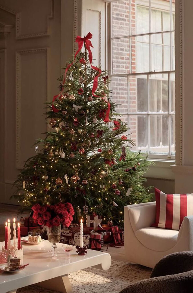
Red is the most emotionally charged Christmas color. In interior design, it represents warmth, passion, and connection, but it must be used carefully.
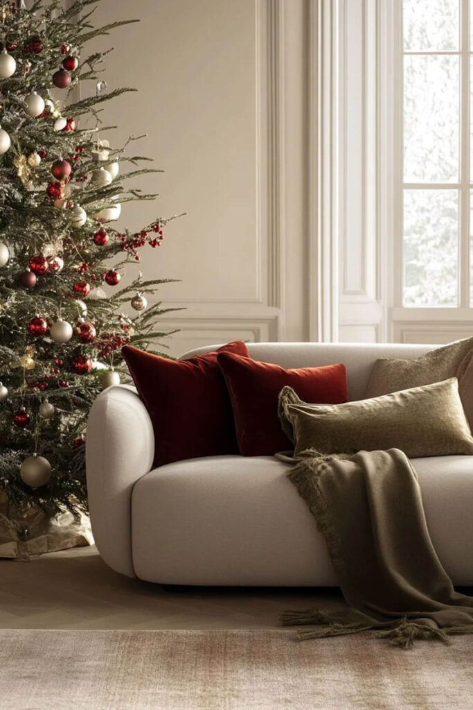
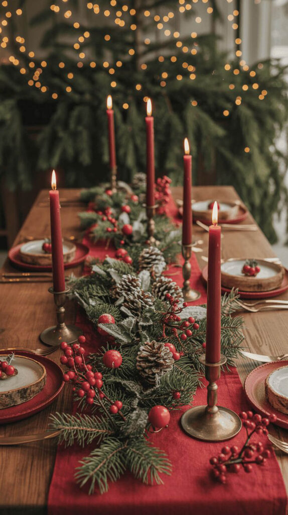
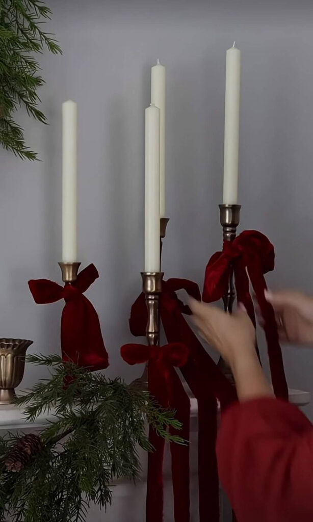
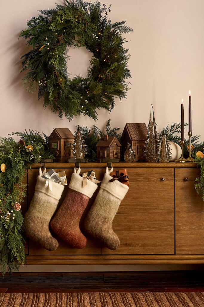
In Christmas movie interiors and seasonal styling, red is rarely dominant. Instead, it appears in controlled accents: cushions, ribbons, table settings, artwork, or textiles.
Interior design lesson: Red works best as an accent color. Used sparingly, it draws attention and creates emotional warmth without overwhelming a space.
Design tip for year-round interiors:
- Choose muted reds like burgundy, terracotta, or brick.
- Limit red to small surfaces or soft furnishings.
- Balance it with neutrals to avoid visual fatigue.
Green: Balance, Calm, and Natural Connection
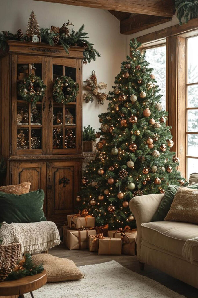
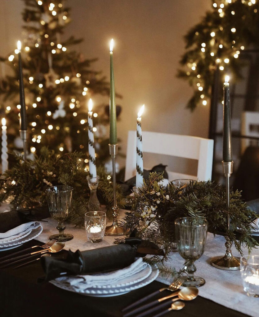
Green is one of the most versatile colors in interior design, and Christmas reminds us why. From evergreen trees to garlands, green represents nature, stability, and renewal.
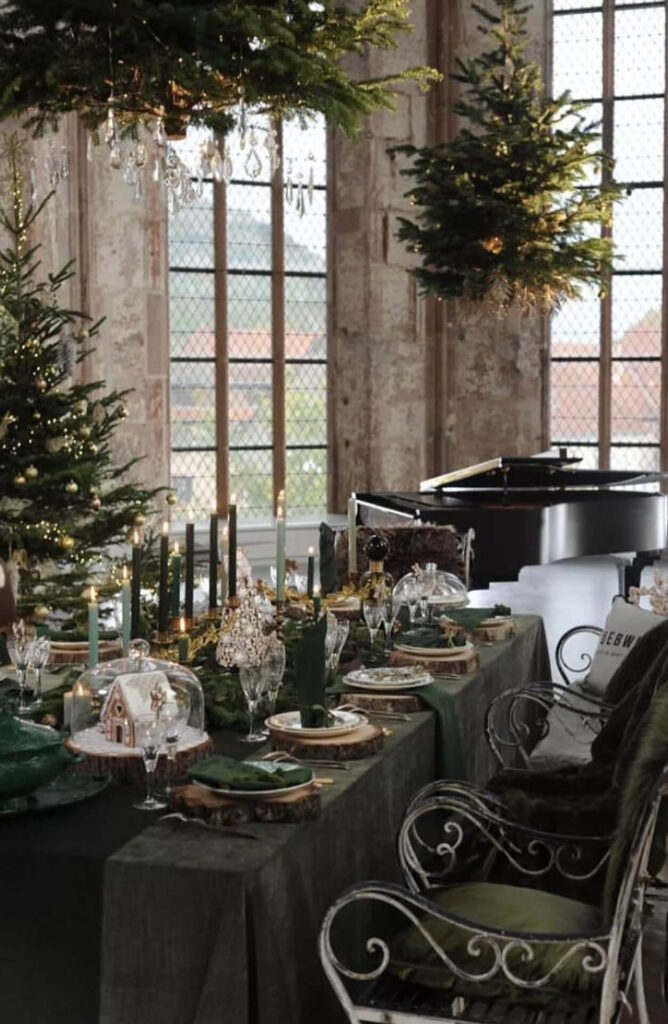
In interiors, green works beautifully on larger surfaces (walls, cabinetry, upholstery) because it is naturally calming.
Interior design lesson: Green creates harmony and balance. It pairs effortlessly with wood, stone, linen, and brass.
Popular interior design applications:
- Deep green walls in living rooms or dining spaces.
- Olive or sage upholstery for timeless appeal.
- Plants as permanent design elements, not seasonal décor.
Gold: Light, Luxury, and Subtle Celebration
Gold is often misunderstood in interior design. Christmas shows us its best use, not as excess, but as reflection.
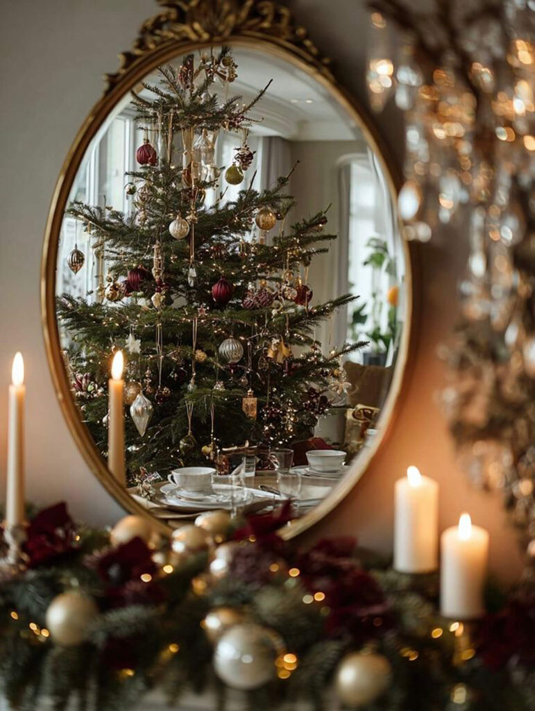
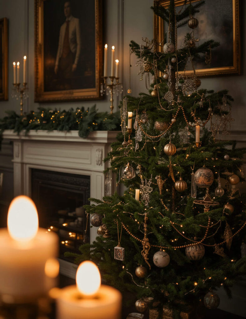
In holiday interiors, gold appears through candlelight, metallic ornaments, frames, and hardware, enhancing light rather than dominating color palettes.
Interior design lesson: Gold works best as a supporting element. Its role is to amplify warmth and light.
Design tips:
- Choose brushed or aged gold over high-shine finishes.
- Use gold in lighting fixtures, handles, mirrors, or small accessories.
- Pair gold with warm neutrals for a sophisticated look.
Neutrals: The Foundation of Timeless Interiors
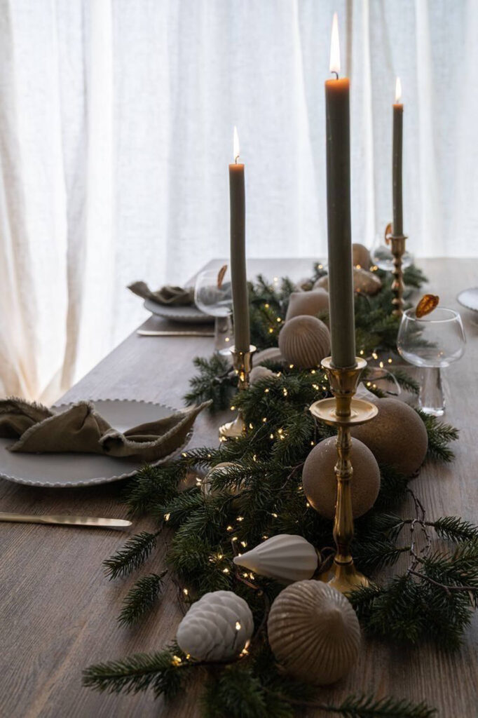
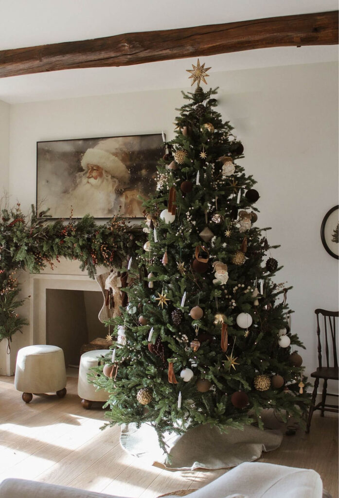
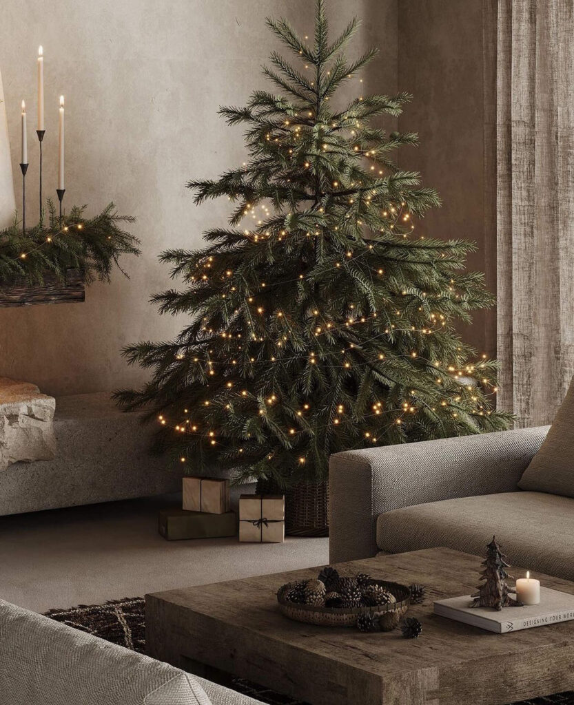
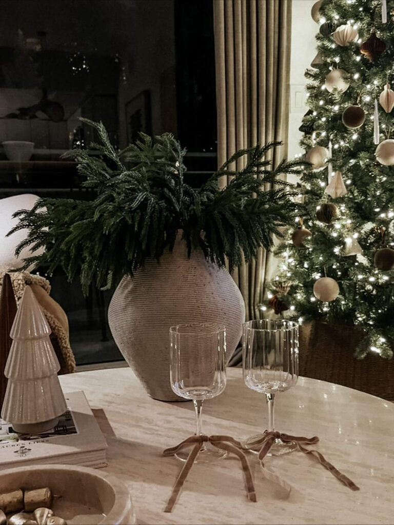
Modern Christmas interiors increasingly rely on neutrals: soft whites, warm beiges, greige, taupe, and natural wood tones.
These colors allow festive elements to shine while maintaining visual calm.
Interior design lesson: Neutrals are not boring, they are strategic. They create space for layering, seasonal changes, and long-term flexibility.
Benefits of neutral interiors:
- They age well.
- They support both minimal and layered styling.
- They make seasonal color updates effortless.

How Christmas Color Palettes Teach Balance
What makes Christmas interiors visually successful is not the colors themselves, but their balance. Rarely do we see all colors competing equally.
Instead:
- Neutrals dominate.
- Green grounds the space.
- Red adds emotional highlights.
- Gold reflects light and warmth.
Designing with Color That Tells a Story
Christmas color stories remind us that color is emotional, symbolic, and deeply connected to how we experience space. When used thoughtfully, red, green, gold, and neutrals can move beyond seasonal decoration and become part of a timeless interior design strategy.
The goal is not to decorate for a season, but to design a home that feels warm, meaningful, and alive all year long.
0 comments